SKIP TO CONTENT
Worksheet Generator
Subjects
Grades
Worksheets
Games
Build a Worksheet
More Resources
Roly Recommends
Summer Boost
Subjects
Grades
Worksheets
Games
Build a Worksheet
More Resources
Roly Recommends
Summer Boost
Showing Results for interpreting graphs
Filters
426 results
Search for: interpreting, graphs
✕
Clear all
426 results
Filters
Search for: interpreting, graphs
✕
Subjects
Math
English Language Arts
Science
Social Studies
Grade Level
Pre-K
K
1st
2nd
3rd
4th
5th
6th
7th
8th
Early Childhood
Elementary School
Middle School
Resource Type
Worksheets
Games
Lesson Plans
Interactive Worksheets
Workbooks
Activities
Exercises
Offline Games
Guided Lessons
Teacher Resources
See more
Occasion
Women's History Month
Spring
Summer
Back to School
Fall
Winter
Holidays
Martin Luther King Jr. Day
Valentine's Day
Black History Month
See more
Common Core
Yes
Roly Recommends
Social Emotional Learning
Game Type
Ball Games
Puzzles & Sudoku
Word Puzzles
Arts & Crafts
Arts & Crafts
Painting & Drawing
English Language Support
Yes
Clear all
View 426 results
Showing Results for interpreting graphs
Filters
426 results
Search for: interpreting, graphs
✕
Clear all
426 results
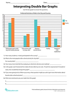
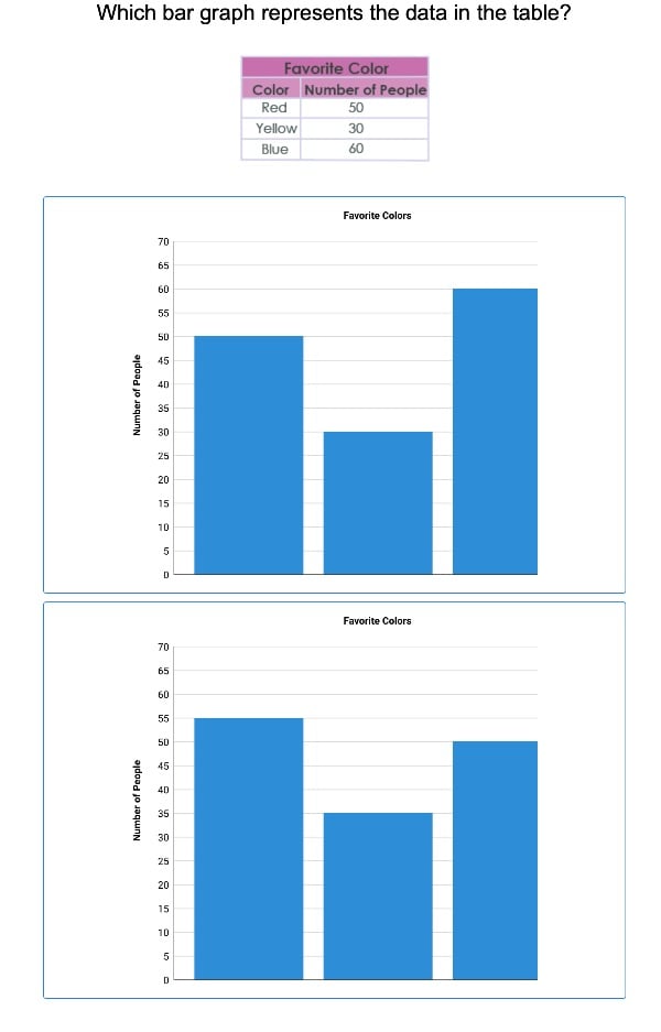
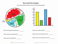
Interpreting Double Bar Graphs
Worksheet
Interpreting Double Bar Graphs
Fifth Grade
Data and Graphing
Students will cultivate the skills of reading, interpreting, and analyzing bar graphs with these questions that activate higher order thinking.
Worksheet
Interpreting Double Bar Graphs
Worksheet
Interpreting Double Bar Graphs
Students will cultivate the skills of reading, interpreting, and analyzing bar graphs with these questions that activate higher order thinking.
Fifth Grade
Data and Graphing
Worksheet
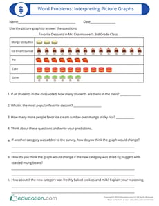
Word Problems: Interpreting Picture Graphs
Worksheet
Word Problems: Interpreting Picture Graphs
Third Grade
Data and Graphing
Students will cultivate the skills of reading, interpreting and analyzing picture graphs with this word problem that activates higher order thinking.
Worksheet
Word Problems: Interpreting Picture Graphs
Worksheet
Word Problems: Interpreting Picture Graphs
Students will cultivate the skills of reading, interpreting and analyzing picture graphs with this word problem that activates higher order thinking.
Third Grade
Data and Graphing
Worksheet
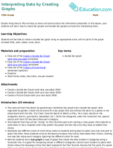
Interpreting Data by Creating Graphs
Lesson Plan
Interpreting Data by Creating Graphs
Fifth Grade
Graphs bring data to life and help us draw conclusions about the information presented. In this lesson, your students will learn how to create bar graphs and double bar graphs and practice interpreting them.
Lesson Plan
Interpreting Data by Creating Graphs
Lesson Plan
Interpreting Data by Creating Graphs
Graphs bring data to life and help us draw conclusions about the information presented. In this lesson, your students will learn how to create bar graphs and double bar graphs and practice interpreting them.
Fifth Grade
Lesson Plan
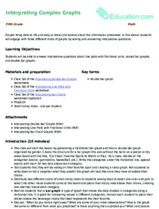
Interpreting Complex Graphs
Lesson Plan
Interpreting Complex Graphs
Fifth Grade
Math
Graphs bring data to life and help us draw conclusions about the information presented. In this lesson students will engage with three different kinds of graphs by asking and answering interpretive questions.
Lesson Plan
Interpreting Complex Graphs
Lesson Plan
Interpreting Complex Graphs
Graphs bring data to life and help us draw conclusions about the information presented. In this lesson students will engage with three different kinds of graphs by asking and answering interpretive questions.
Fifth Grade
Math
Lesson Plan
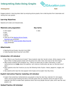
Interpreting Data Using Graphs
Lesson Plan
Interpreting Data Using Graphs
Kindergarten
Data and Graphing
Engage students in learning about data by analyzing picture graphs, then collecting data from classmates and making their own graphs!
Lesson Plan
Interpreting Data Using Graphs
Lesson Plan
Interpreting Data Using Graphs
Engage students in learning about data by analyzing picture graphs, then collecting data from classmates and making their own graphs!
Kindergarten
Data and Graphing
Lesson Plan
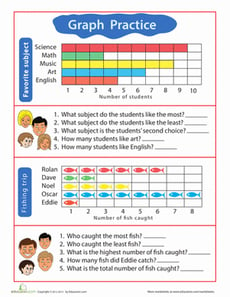
Interpreting Line Plots, Bar Graphs and Picture Graphs: Word Problems
Lesson Plan
Interpreting Line Plots, Bar Graphs and Picture Graphs: Word Problems
Third Grade
Graphs bring data to life and help us draw conclusions about the information. In this lesson, students will engage with three different kinds of graphs by asking and answering interpretive questions.
Lesson Plan
Interpreting Line Plots, Bar Graphs and Picture Graphs: Word Problems
Lesson Plan
Interpreting Line Plots, Bar Graphs and Picture Graphs: Word Problems
Graphs bring data to life and help us draw conclusions about the information. In this lesson, students will engage with three different kinds of graphs by asking and answering interpretive questions.
Third Grade
Lesson Plan
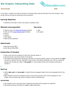
Bar Graphs: Interpreting Data
Lesson Plan
Bar Graphs: Interpreting Data
Second Grade
Data and Graphing
In this lesson, students will make bar graphs and interpret data using real-life data from other students. They will get practice writing and answering survey questions.
Lesson Plan
Bar Graphs: Interpreting Data
Lesson Plan
Bar Graphs: Interpreting Data
In this lesson, students will make bar graphs and interpret data using real-life data from other students. They will get practice writing and answering survey questions.
Second Grade
Data and Graphing
Lesson Plan
Interpreting Graphs of Proportional Relationships
Interactive Worksheet
Interpreting Graphs of Proportional Relationships
Seventh Grade
Ratios and Proportions
Practice analyzing graphs that represent proportional relationships in the real world with this seventh- and eighth-grade math worksheet!
Interactive Worksheet
Interpreting Graphs of Proportional Relationships
Interactive Worksheet
Interpreting Graphs of Proportional Relationships
Practice analyzing graphs that represent proportional relationships in the real world with this seventh- and eighth-grade math worksheet!
Seventh Grade
Ratios and Proportions
Interactive Worksheet
Introduction to Graphs: Bar Graphs
Worksheet
Introduction to Graphs: Bar Graphs
Third Grade
Data and Graphing
This introduction to graphs will give your child extra practice reading, analyzing, and building bar graphs.
Worksheet
Introduction to Graphs: Bar Graphs
Worksheet
Introduction to Graphs: Bar Graphs
This introduction to graphs will give your child extra practice reading, analyzing, and building bar graphs.
Third Grade
Data and Graphing
Worksheet
Interpreting Bar Chart Graphs
Worksheet
Interpreting Bar Chart Graphs
Fifth Grade
Data and Graphing
Learners practice using a bar graph to answer questions in this data and graphing worksheet.
Worksheet
Interpreting Bar Chart Graphs
Worksheet
Interpreting Bar Chart Graphs
Learners practice using a bar graph to answer questions in this data and graphing worksheet.
Fifth Grade
Data and Graphing
Worksheet
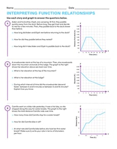
Interpreting Function Relationships
Worksheet
Interpreting Function Relationships
Eighth Grade
Algebra
In this eighth-grade algebra worksheet, students use brief stories and graphs to answer questions about real-world function relationships.
Worksheet
Interpreting Function Relationships
Worksheet
Interpreting Function Relationships
In this eighth-grade algebra worksheet, students use brief stories and graphs to answer questions about real-world function relationships.
Eighth Grade
Algebra
Worksheet
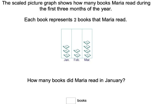
Scaled Picture Graphs
Exercise
Scaled Picture Graphs
Third Grade
Data and Graphing
For amateur mathematicians, this exercise will incorporate neat pictures into math time with scaled picture graphs.
Exercise
Scaled Picture Graphs
Exercise
Scaled Picture Graphs
For amateur mathematicians, this exercise will incorporate neat pictures into math time with scaled picture graphs.
Third Grade
Data and Graphing
Exercise
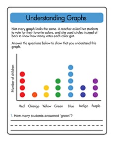
Understanding Graphs
Worksheet
Understanding Graphs
First Grade
Data and Graphing
Test your first grader's understanding of graphs and the information they provide with this worksheet.
Worksheet
Understanding Graphs
Worksheet
Understanding Graphs
Test your first grader's understanding of graphs and the information they provide with this worksheet.
First Grade
Data and Graphing
Worksheet
Bike Pictograph Questions
Worksheet
Bike Pictograph Questions
Second Grade
Data and Graphing
With these pictograph questions, your kid will hone his skills at reading and interpreting graphs.
Worksheet
Bike Pictograph Questions
Worksheet
Bike Pictograph Questions
With these pictograph questions, your kid will hone his skills at reading and interpreting graphs.
Second Grade
Data and Graphing
Worksheet
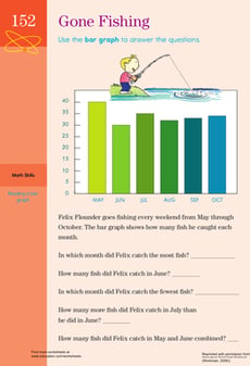
Getting Graphs: Gone Fishing!
Worksheet
Getting Graphs: Gone Fishing!
Third Grade
Data and Graphing
Hunting for a worksheet to help your kid with graphs? This printable helps your child to understand bar graphs.
Worksheet
Getting Graphs: Gone Fishing!
Worksheet
Getting Graphs: Gone Fishing!
Hunting for a worksheet to help your kid with graphs? This printable helps your child to understand bar graphs.
Third Grade
Data and Graphing
Worksheet
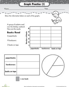
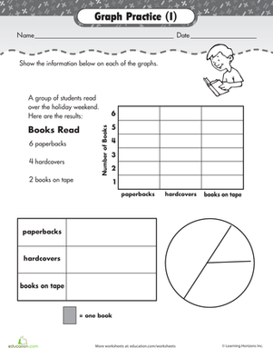
Practice Graphs
Worksheet
Practice Graphs
Second Grade
Data and Graphing
Kids practice representing a set of data using three kinds of graphs: a bar graph, pictograph, and pie graph.
Worksheet
Practice Graphs
Worksheet
Practice Graphs
Kids practice representing a set of data using three kinds of graphs: a bar graph, pictograph, and pie graph.
Second Grade
Data and Graphing
Worksheet
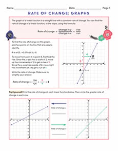
Rate of Change: Graphs
Worksheet
Rate of Change: Graphs
Eighth Grade
Algebra
In Rate of Change: Graphs, eighth-grade learners will learn how to read graphs of linear functions to find the rate of change.
Worksheet
Rate of Change: Graphs
Worksheet
Rate of Change: Graphs
In Rate of Change: Graphs, eighth-grade learners will learn how to read graphs of linear functions to find the rate of change.
Eighth Grade
Algebra
Worksheet
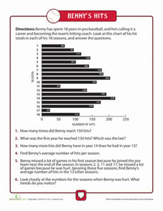
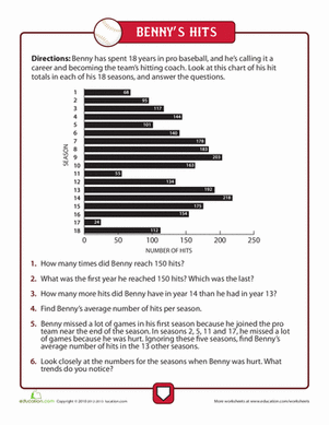
Reading Graphs
Worksheet
Reading Graphs
Third Grade
Data and Graphing
Try getting started with reading graphs with this worksheet showing a baseball player's hits throughout his career, and answer the word problems.
Worksheet
Reading Graphs
Worksheet
Reading Graphs
Try getting started with reading graphs with this worksheet showing a baseball player's hits throughout his career, and answer the word problems.
Third Grade
Data and Graphing
Worksheet
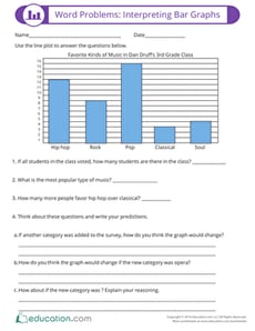
Word Problems: Interpreting Bar Graphs
Worksheet
Word Problems: Interpreting Bar Graphs
Third Grade
Data and Graphing
Worksheet
Word Problems: Interpreting Bar Graphs
Worksheet
Word Problems: Interpreting Bar Graphs
Third Grade
Data and Graphing
Worksheet
Scaled Bar Graphs
Exercise
Scaled Bar Graphs
Third Grade
Data and Graphing
This exercise will clarify just how scaled bar graphs represent data found in math problems.
Exercise
Scaled Bar Graphs
Exercise
Scaled Bar Graphs
This exercise will clarify just how scaled bar graphs represent data found in math problems.
Third Grade
Data and Graphing
Exercise
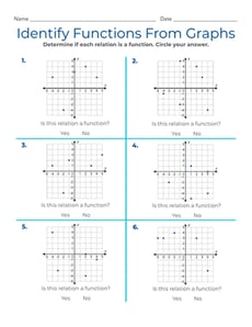
Identify Functions From Graphs
Interactive Worksheet
Identify Functions From Graphs
Eighth Grade
Algebra
Get practice identifying functions from graphs with this eighth-grade algebra worksheet!
Interactive Worksheet
Identify Functions From Graphs
Interactive Worksheet
Identify Functions From Graphs
Get practice identifying functions from graphs with this eighth-grade algebra worksheet!
Eighth Grade
Algebra
Interactive Worksheet
Reading Picture Graphs: Eye Colors
Worksheet
Reading Picture Graphs: Eye Colors
Kindergarten
Teach kindergarteners how to read picture graphs with this worksheet all about the eye colors of the students in Ms. Swan's class.
Worksheet
Reading Picture Graphs: Eye Colors
Worksheet
Reading Picture Graphs: Eye Colors
Teach kindergarteners how to read picture graphs with this worksheet all about the eye colors of the students in Ms. Swan's class.
Kindergarten
Worksheet
Graph Math
Activity
Graph Math
Fifth Grade
Data and Graphing
Increase your child's confidence in interpreting bar graphs and throw a little candy into the mix to sweeten the learning process.
Activity
Graph Math
Activity
Graph Math
Increase your child's confidence in interpreting bar graphs and throw a little candy into the mix to sweeten the learning process.
Fifth Grade
Data and Graphing
Activity
Different Types of Graphs: Picture and Bar Graphs
Worksheet
Different Types of Graphs: Picture and Bar Graphs
First Grade
Data and Graphing
Sure to test your kid's graphing skills, this graph worksheet features two different types of graphs and questions to go along with them.
Worksheet
Different Types of Graphs: Picture and Bar Graphs
Worksheet
Different Types of Graphs: Picture and Bar Graphs
Sure to test your kid's graphing skills, this graph worksheet features two different types of graphs and questions to go along with them.
First Grade
Data and Graphing
Worksheet
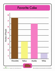
Beginning Bar Graphs: Favorite Cake
Worksheet
Beginning Bar Graphs: Favorite Cake
First Grade
Data and Graphing
This favorite cake bar graph makes reading bar graphs simple for kids to understand.
Worksheet
Beginning Bar Graphs: Favorite Cake
Worksheet
Beginning Bar Graphs: Favorite Cake
This favorite cake bar graph makes reading bar graphs simple for kids to understand.
First Grade
Data and Graphing
Worksheet
Identify Proportional Relationships From Graphs
Worksheet
Identify Proportional Relationships From Graphs
Seventh Grade
Ratios and Proportions
Practice identifying proportional relationships from graphs with this two-page math worksheet!
Worksheet
Identify Proportional Relationships From Graphs
Worksheet
Identify Proportional Relationships From Graphs
Practice identifying proportional relationships from graphs with this two-page math worksheet!
Seventh Grade
Ratios and Proportions
Worksheet
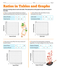
Ratios in Tables and Graphs
Worksheet
Ratios in Tables and Graphs
Sixth Grade
Ratios and Proportions
Practice filling in ratios in tables and graphs with this sixth-grade math worksheet!
Worksheet
Ratios in Tables and Graphs
Worksheet
Ratios in Tables and Graphs
Practice filling in ratios in tables and graphs with this sixth-grade math worksheet!
Sixth Grade
Ratios and Proportions
Worksheet
Practice Test: Bar Graphs and Pictograms
Worksheet
Practice Test: Bar Graphs and Pictograms
First Grade
Data and Graphing
Help your first grader review simple graphs with this nifty printable practice quiz.
Worksheet
Practice Test: Bar Graphs and Pictograms
Worksheet
Practice Test: Bar Graphs and Pictograms
Help your first grader review simple graphs with this nifty printable practice quiz.
First Grade
Data and Graphing
Worksheet
Pictogram: Get Into Graphs
Worksheet
Pictogram: Get Into Graphs
Second Grade
Data and Graphing
Introduce your second grader to graphs with this worksheet that asks kids to read a pictogram and answer a set of questions.
Worksheet
Pictogram: Get Into Graphs
Worksheet
Pictogram: Get Into Graphs
Introduce your second grader to graphs with this worksheet that asks kids to read a pictogram and answer a set of questions.
Second Grade
Data and Graphing
Worksheet
Bar Graphs: School Subjects
Worksheet
Bar Graphs: School Subjects
Second Grade
Data and Graphing
Math students, get ready to graph! Here is a great worksheet that will help your student practice making bar graphs from information provided.
Worksheet
Bar Graphs: School Subjects
Worksheet
Bar Graphs: School Subjects
Math students, get ready to graph! Here is a great worksheet that will help your student practice making bar graphs from information provided.
Second Grade
Data and Graphing
Worksheet
1
2
3
4
…
15