Data and Graphing Resources
661 results
Math
✕661 results
Data and Graphing Resources
661 results
Math
✕661 results


About Data And Graphing Resources
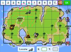
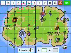
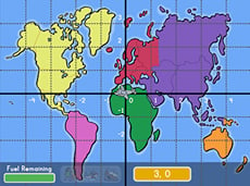
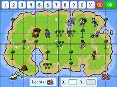
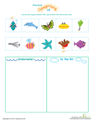
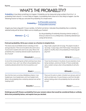
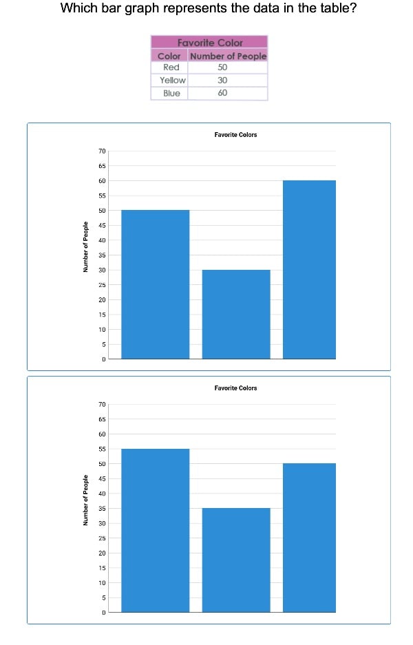
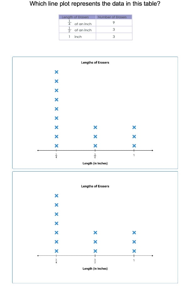
On Education.com, data and graphing resources introduce students to collecting, organizing, and interpreting information through hands-on activities. These materials provide worksheets, charts, and interactive lessons that help learners understand how to visualize data and analyze trends effectively. Building foundational skills in data handling prepares students for higher-level mathematics, sciences, and real-world problem-solving.
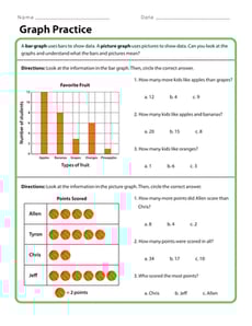
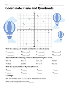
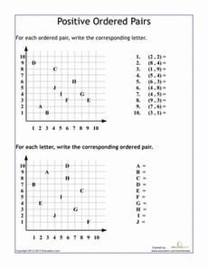
At Education.com, teachers and parents can find a wide range of digital simulations, printable worksheets, and interactive worksheets to support data and graphing lessons. These resources include bar graphs, line charts, circle graphs, and scatter plots designed to develop students’ ability to interpret and create visual representations of data. Structuring exercises from basic to advanced levels helps learners strengthen critical thinking and comprehension.
Using data and graphing resources on Education.com, educators, tutors, and parents can create practical projects and exercises that engage children in applying math concepts to everyday scenarios. These structured activities make lessons dynamic and accessible, saving time in lesson planning while providing clear, focused instruction.