
Activity
Get Halloween Math Practice with Candy Calories

Have you ever wondered which Halloween candy has the most calories per gram? Here’s a way for your student to figure it out. By tracking nutritional information from candy wrappers, your student can use statistics to find which treats offer the fewest tricks. Here’s a lesson that will help him review how to make some important types of graphs, and help him remember which kind is best to use with different types of data.


Related learning resources
Halloween Candy Math
Worksheet
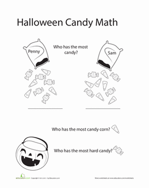
Halloween Candy Math
Help Penny and Sam sort out their Hallows-Eve hauls in the Halloween candy math worksheet.
Math
Worksheet

Fresh Or Canned Calories?
Activity
Fresh Or Canned Calories?
Determine whether fresh vegetables have more calories or less calories than canned vegetables.
Math
Activity
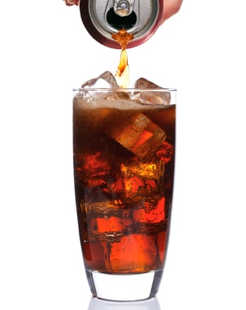
Soda Calories
Activity
Soda Calories
Gather some friends for a bubbly soda taste test do determine calories' role in your favorite drinks.
3rd Grade
Science
Activity